
Bold design is born from intention; free from chaos or excess. And the spaces that feel most alive are often built on contrast. Light against dark. Softness beside structure. Vintage paired with contemporary. At ASD, contrast isn’t a stylistic trick. It’s a foundational design principle that gives a space its unrepeatable character.
Stylist: Kristi Hunter
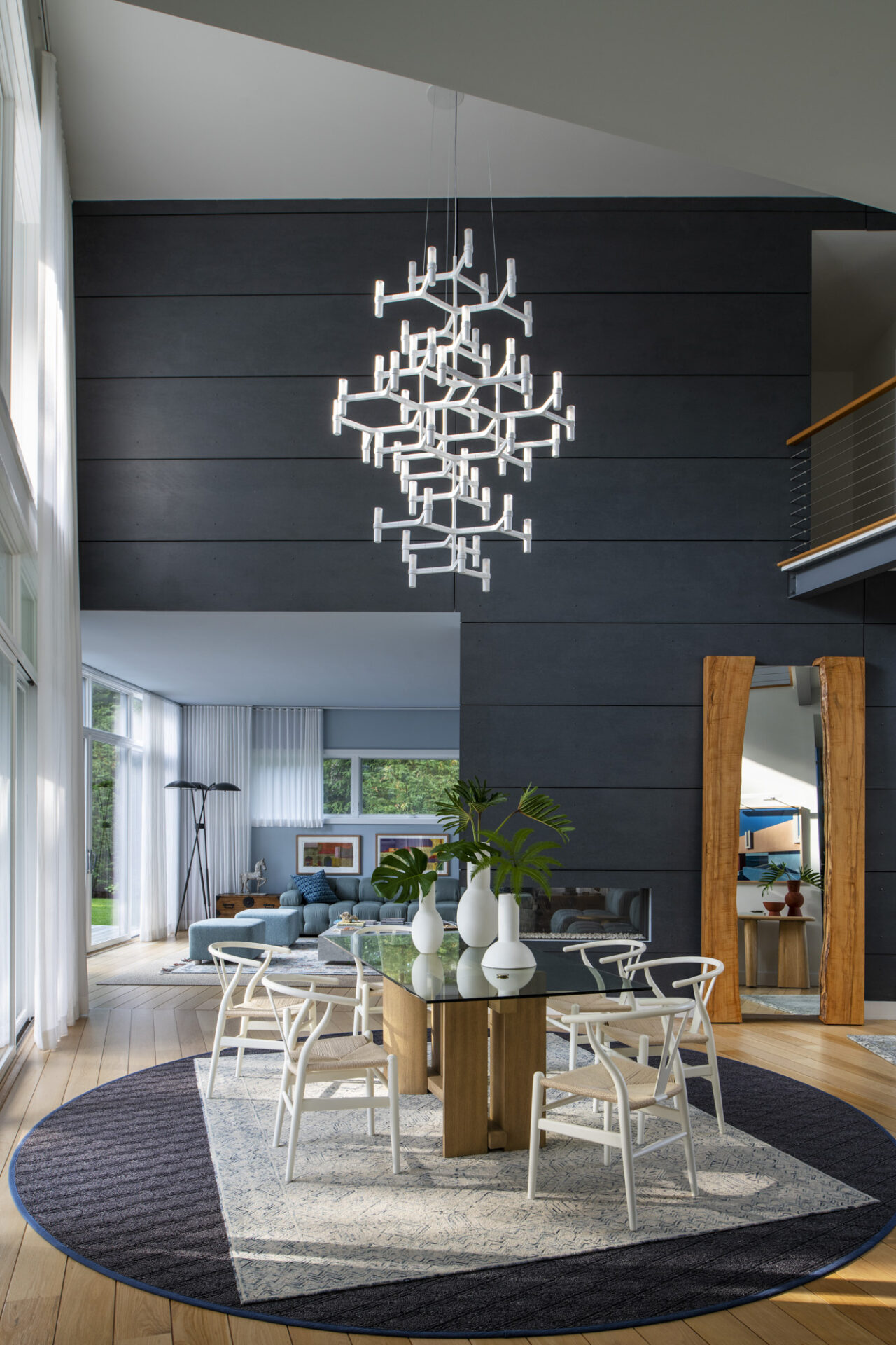
Contrast as Architecture, Not Decoration
Before color palettes or furniture selections enter the conversation, contrast starts with form.
When I step into a space, I read the bones first. I note ceiling heights, window placement, circulation patterns, and how rooms relate to each other. These architectural elements naturally create moments of tension and release. Compression followed by openness. Shadow, then light. Our role as designers is to recognize and amplify these moments.
Stylist: Martin Bourne
Contrast in an architectural sense looks like a clean-lined room that gains richness through millwork or subtle shifts in scale. Not ornamentation for ornamentation’s sake. We’re searching for depth that feels intrinsic to the space; like it’s somehow always belonged.
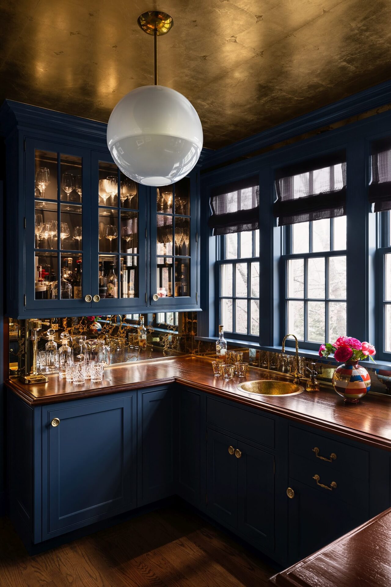
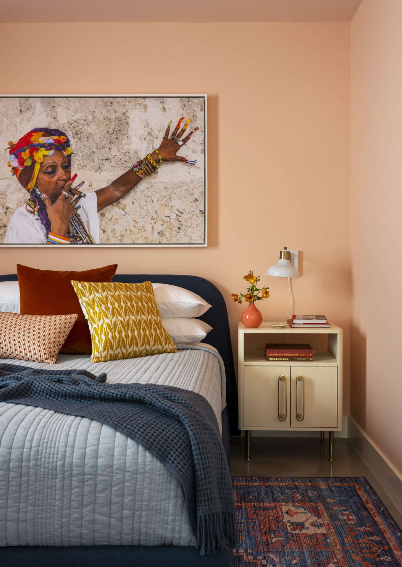
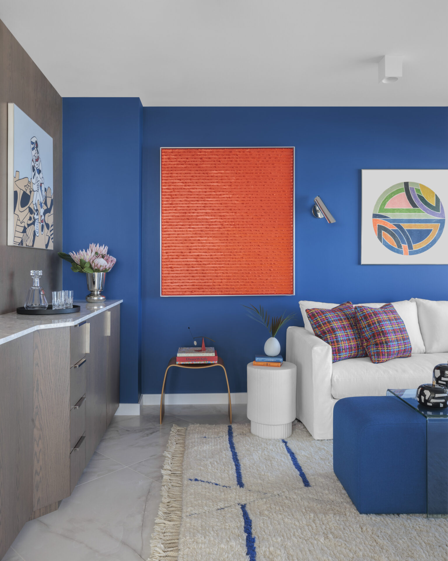
Light & Dark: Creating Drama Without Overwhelm
Deep, saturated hues can feel expansive when they’re handled with restraint and balance. Some may think dark tones close a room in, but they don’t have to. They’re grounding. The key is allowing light to move across the walls or along the ceiling and adjacent spaces so darker surfaces feel alive.
In both our Bronxville and Great Falls projects, we embraced moody palettes that remain inviting because they’re counterbalanced by natural light or reflective surfaces. Dark tones act as a backdrop in these cases, instead of a boundary.
Stylist: Martin Bourne
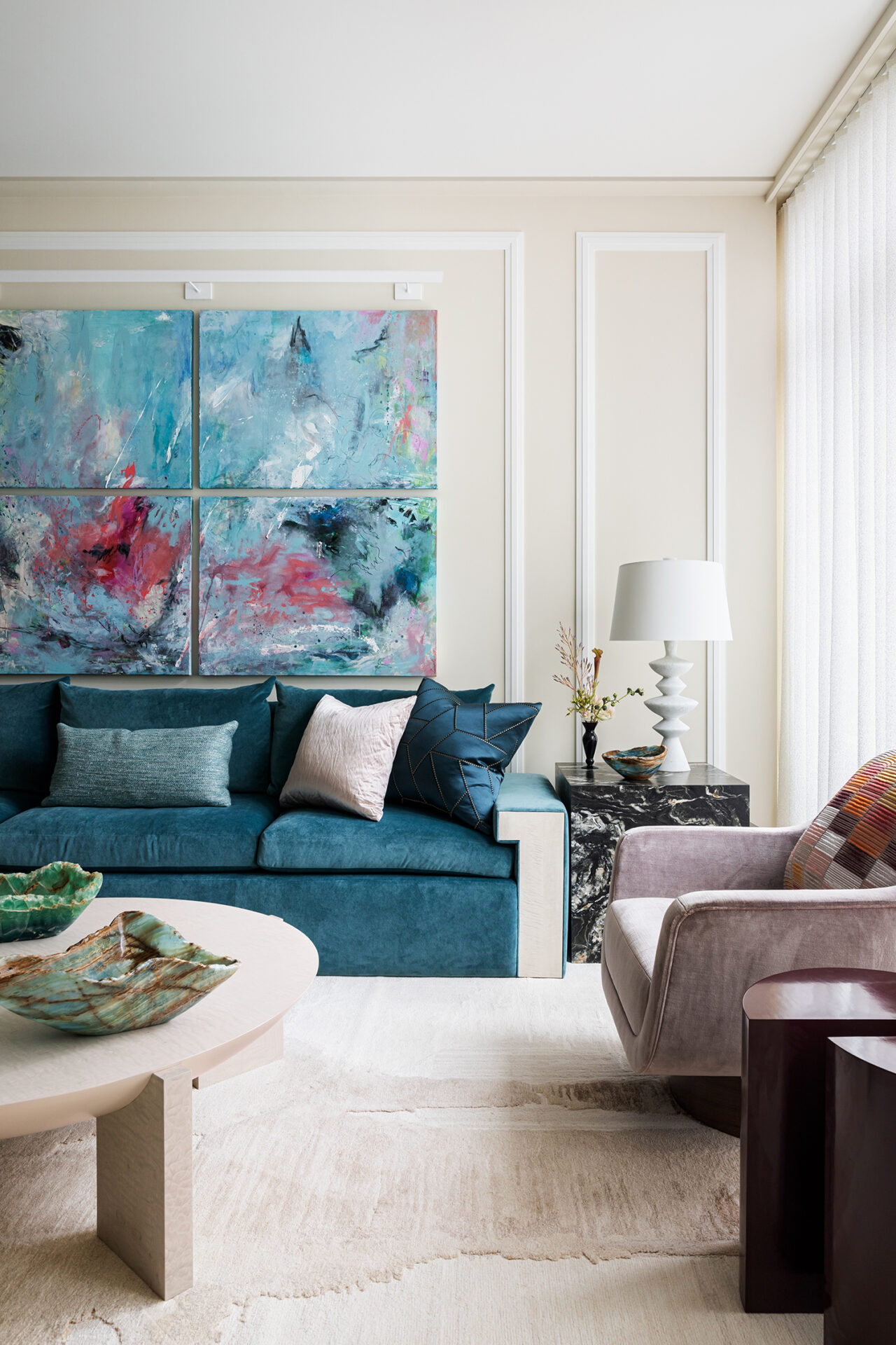
Soft & Structured: The Role of Texture
Texture is the quiet hero of contrast.
Tactile elements soften the edges of a bold space. Plush upholstery paired with crisp silhouettes. Glossy finishes set against matte or hand-hewn surfaces. This interplay creates comfort without diluting impact.
We love using texture as a contrast point. It’s an element that invites touch and introduces warmth, while keeping high-end design moments from being overly precious. Texture keeps design feeling human and lived-in.
Stylist: Anthony Santelli
Vintage & Modern: Timeless Tension
Some of the most compelling interiors live between eras.
I’m drawn to rooms where a single antique interrupts an otherwise contemporary narrative. The tension between old and new keeps a space from becoming static or overly curated. We can avoid the trap of “period rooms” and instead create environments that feel collected over time. Take our Beekman Place Townhouse, where we juxtaposed our client’s incredible set of delicate vintage dishware with clean-edged, modern millwork.
Vintage brings soul, and modern form brings clarity. Together, they create spaces that feel timeless and trendless.
Color Contrast: More Than Just Opposites on a Wheel
Color play is nuanced. We don’t blindly choose a couple of shades off of the color wheel.
We know that saturated color gains power when it’s placed beside quiet neutrals. Or that warm and cool undertones create subtle movement to lead the eye through a home. We select shades that reinforce a mood and contribute to a home’s flow, without competing for attention.
Stylist: Anthony Santelli
The Emotional Impact of Contrast
Well-balanced contrast is emotive.
Intrigue and intimacy. Energy and calm. Contrast shapes how a room is actually experienced. It invites pause in one space, and momentum in another.
But we understand that implementing contrast can feel like taking a leap for some homeowners. We find that decisions are most successful when our clients feel guided, not pushed. Our role is to know when to lean in, and how to bring clients along in the process.
Stylist: Lazaro Arias
GC: BA Building, Inc.
Bold Design Thrives on Balance
There’s a reason why homogenous, cookie-cutter interiors aren’t memorable. Remarkable design succeeds because of thoughtful tension. Spaces where opposites coexist in harmony.
Curious how contrast could elevate your home?
Explore our portfolio or reach out to the ASD studio to get in touch.


