Stylist: Anthony Santelli
Many of our clients are art collectors, and their artwork is not something to be placed at the end of a project. It’s where the design begins.
A significant piece carries weight. It establishes tone and informs palette to introduce a level of personality that can’t be replicated through materials alone. We treat each collection as a point of origin; something that guides the broader direction of the home.
Materials, color, proportion, and lighting are all considered in relation to the work itself. Architecture is shaped to frame it. Millwork and furnishings are designed to support it. Texture and tone are layered to reinforce its presence without competing for attention.
The result is a home that feels cohesive rather than composed. Where the artwork is not simply placed within the space, but embedded into it.
In the sections that follow, we’ll explore the principles that allow art to lead, and the design decisions that ensure it’s experienced as it should be.
Begin with the Art Collection. Not the Palette.
Art defines the design’s direction. Not the other way around.
We assess a client’s pieces to understand the scale, the medium, color family, and emotional tone of the collection. This helps us to identify hero pieces versus supporting works, and therefore lends a better understanding of how and where we’ll place the pieces.

Stylist: Anthony Santelli

Stylist: Anthony Santelli
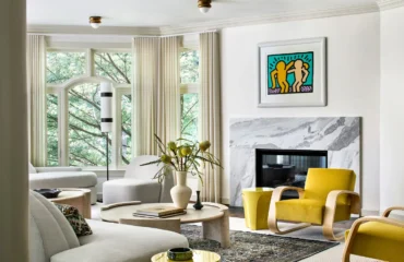
Our East Hampton client has a superb collection of colorful contemporary pieces that we strategically placed throughout his home. A large format piece in the living room (shown above) establishes structure within the space. Its hard-edge geometry and disciplined color blocking introduce a clear visual language, one that the rest of the room quietly responds to. Rounded, low-profile seating echoes the circular form of the artwork, softening its precision.
We opted for an intentionally restrained palette of muted blues and neutrals to allow the artwork’s sharper tones to hold focus. We gave the piece scale and breathing room, so it reads as an anchor rather than an accessory.
White Space as Intention
Restraint creates clarity.
We implement negative space to elevate artwork and avoid visual noise in high-value collections. Whites, ivories, creams, and soft tonal backdrops create calm, controlled palettes so that a piece can stand on its own or as a collection.
Instead of thinking of white as empty space, we see it as strategic. Our Sloans Curve clients enlisted us to design their Palm Beach home with their prized art collection as the focal point. We completely reimagined the architecture and interiors to create a light-filled, open space with seamless connection to the living, kitchen, and dining areas. By prioritizing a more open layout, we created more room for their pieces to be on prominent display.
Clean white gallery walls, neutral furnishings, tactile textures, and sculptural fixtures create a subtle yet refined setting for their vibrant, eclectic pieces.

Stylist: Lazaro Arias
GC: BA Building, Inc.
Scale & Sightlines: Planning the Experience of Art
Art should be experienced, and that is why we place a strong emphasis on placement. The way you encounter art at home should feel deliberate, almost architectural.
We design sightlines from entry points and key circulation paths, with proper scaling relative to walls, ceilings, millwork, and furniture. This helps to create both moments of pause, and moments of continuous visual flow.

Stylist: Anthony Santelli
Rather than placing the above figurative coastal painting in a static room of our East Hampton project, we positioned it within a vertical passage, where the natural movement of the figures mirrors the movement of the person ascending or descending the staircase. And the artwork’s tall scale reinforces the architecture, drawing the eye upward and elongating the space.
Clean white walls and structured paneling create contrast against the painting’s loose, expressive brushwork. This way, the art actually activates the space.
Balancing Modern Art Within Traditional Architecture
Contrast creates tension and sophistication.
By pairing contemporary or abstract pieces with classical detailing such as moulding or paneling, we create a sense of heightened contrast for depth and intrigue. Then, we let cleaned-lined furnishings bridge the gap between eras.

Stylist: Martin Bourne
In our 200 Amsterdam project, this abstract piece does exactly what the architecture alone cannot. It introduces movement, energy, color, and emotional contrast.
Classical moulding establishes order and symmetry in the living room. By placing a large-scale, expressive abstract across that framework, we immediately created a controlled kind of tension. The looseness of the brushwork pushes against the precision of the paneling, which allows both to feel more pronounced. The scale of this piece reinforces the architecture by aligning with the wall’s width and anchoring the below seating area.
And of course, color plays a critical role in all of this. Saturated blues and soft washes of pink introduce depth and variation, which we then echoed in the upholstery and accessories. This creates continuity without dilution. Art leads, and the room responds.

Stylist: Martin Bourne
Lighting for Art: Precision Over Ambiance
Light defines how we see and experience art. By incorporating both natural and artificial light sources, we can highlight color, texture, dimension, and overall presence of a piece within a space.
Placement is critical. Without precision, light can distort and create glare, cast shadows, or unevenly illuminate the surface. By correctly incorporating lighting, one can read a piece as it was intended, with consistency and presence throughout the day.
Stylist: Martin Bourne
In our Bronxville living room we positioned the artwork against richly paneled wood walls, which naturally absorb natural light and deepen shadow. We placed a linear picture light directly above to cast a consistent, controlled wash across the entire surface. This approach preserves the integrity of the work, particularly the colors and linework, so that there are no glares or competing shadows.
The linear picture light also establishes hierarchy, making this piece the focal point. The surrounding ambient light from windows and secondary fixtures supports the room, but this dedicated picture light prioritizes the piece.

When Art Leads, Everything Else Feels Cohesive
The most compelling interiors don’t compete with their artwork. They’re built around it.
Whether a client arrives with a well-established collection or we curate pieces together, art is considered from the outset. It informs scale, palette, placement, and even the experience of a space from one room to the next.
This approach creates cohesion. The architecture frames the work. The furnishings support it. The materials echo its character. Nothing feels incidental.
Art, in this sense, isn’t an addition. We embed it into the design. An integral part of the home’s foundation. If you’re looking to shape a home around your collection, we’d welcome the conversation. Explore our portfolio or connect with the studio to begin.