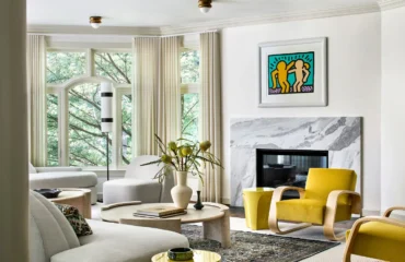
A glance through our portfolio makes one point undeniably clear. Color is central to our work at Andrew Suvalsky Designs.
Over the years, I’ve been playfully dubbed “Mr. Color,” but in truth, my approach to bold hues in interior design is not about spectacle. I employ these colors for structure, atmosphere, and emotional impact.
In luxury interior design, color shapes perception. Defines mood. Reveals architectural nuance. Communicates energy. Whether expressed through saturated paint, patterned wallpaper, custom upholstery, or lacquered finishes, color becomes a vehicle for storytelling, and for creating interiors that feel both distinctive and timeless.
Color is not simply seen, but experienced.
A Thoughtful Framework for Choosing the Right Color
One of the most common questions clients ask is, “How do we know which color is right for our home?”
Before even discussing hues, I read behavior. There are four key questions I ask my clients at the start of a project, and their answers determine where we’ll venture with color:
1. How do you want to feel in this room, and at what time of day?
Morning kitchen light behaves differently than evening bar lighting. A primary bedroom calls for a different atmosphere than a dining room. Color psychology in interior design begins with emotion. Whether it’s a space to energize, ground, relax, or impress guests, color should support the mood the room is meant to emanate.
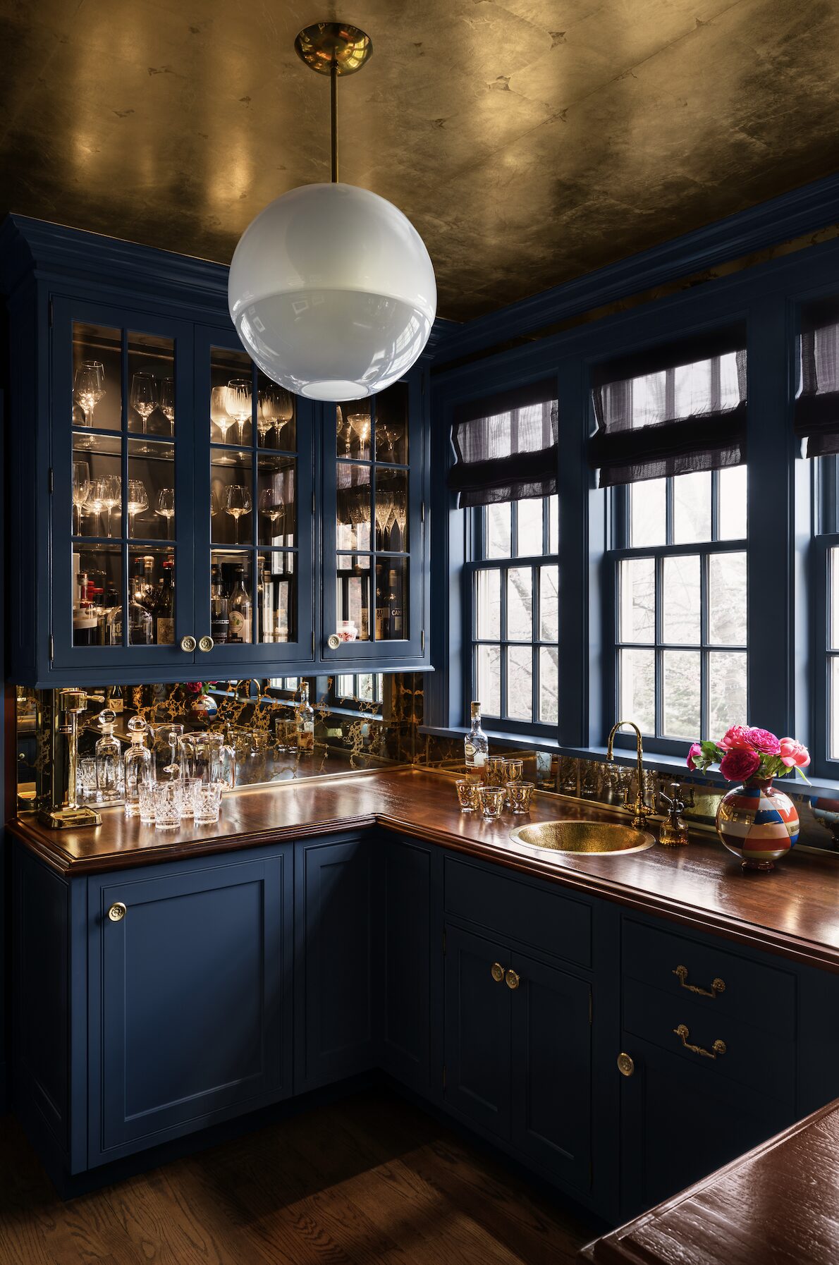
Stylist: Martin Bourne
2. What actually happens in this space?
Take our Bronxville bar as an example. This room is activated in the late afternoon and evening under soft lighting, with sunlight catching the gold-leaf ceiling at just the right angle. Deep, saturated navies amplify intimacy and presence.
When designing luxury interiors for entertaining, color should support the ritual.
3. How does natural light interact with the architecture?
In architectural interiors, light is foundational. Rooms drenched in sunlight can carry deeper hues without feeling heavy. In fact, rich tones often appear luminous when supported by strong natural light.
Whites and pastels reflect and amplify daylight. Saturated shades absorb and create depth. Understanding this relationship ensures bold color feels intentional, not overwhelming.
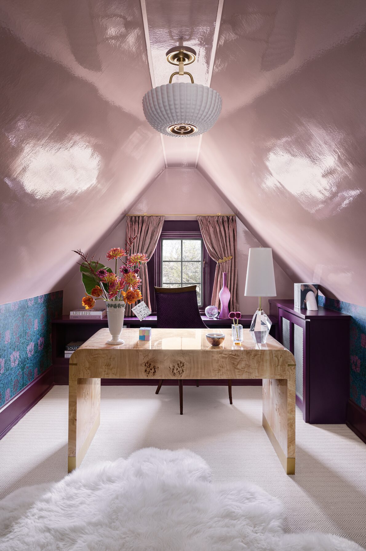
Stylist: Martin Bourne
4. Does a particular shade resonate emotionally?
A shade may evoke confidence, nostalgia, warmth, or clarity. That emotional reaction matters. Timeless interior design is built on what resonates instead of what’s trending.
Understanding How Color Families Shape Interior Atmosphere
Color functions as emotional architecture. It shapes how a space is experienced. And there are specific color families that influence how a room is experienced:
- Blues and greens → grounding, intellectual, steady, calm
- Reds and burgundies → intimate, dramatic, commanding, striking
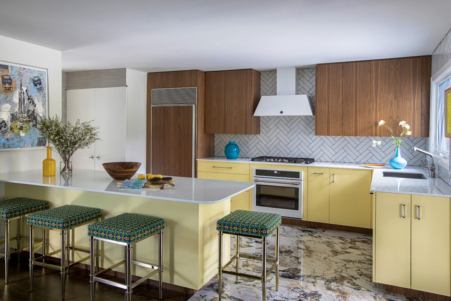
- Yellows and warm ochres → energizing, social, happy, luminous
- Pastels → softening, romantic, nostalgic, comforting
- Deep earth tones → enveloping, assuring, architectural, cozy
The conversation ventures far beyond “bold versus neutral.” It’s about alignment between architecture, materiality, and lifestyle.
Stylist: Anthony Santelli
When Bold Color Works in a Home – and When it Doesn’t
Though my designs lean color-forward, I don’t apply vibrant tones for the sake of being loud.
Bold color works best when:
The architecture can visually hold the saturation.
A material palette, like wood, stone, metal, and hardware, supports it.
Lighting enhances depth and dimension.
Contrast introduces clarity and balance.
Alternatively, bold color fails when:
Proportion is ignored.
There are too many competing elements that crowd the room.
Grounding materials are absent.
Purposeful interior design uses saturation to be strategic.
Stylist: Lazaro Arias
GC: BA Building, Inc.
Why Material and Texture Influence Color
Color behaves differently depending on surface and finish.
A cobalt blue rendered in matte paint reads differently than the same hue applied in velvet or high-gloss lacquer.
Velvet deepens saturation.
Lacquer amplifies reflection.
Marble cools intensity.
Matte finishes soften light.
Brushed metals create a diffused glow.
That’s why even a space with neutral tones can feel dynamic and alive. In our Great Falls kitchen, for example, tonal layering creates richness without relying on contrast alone.
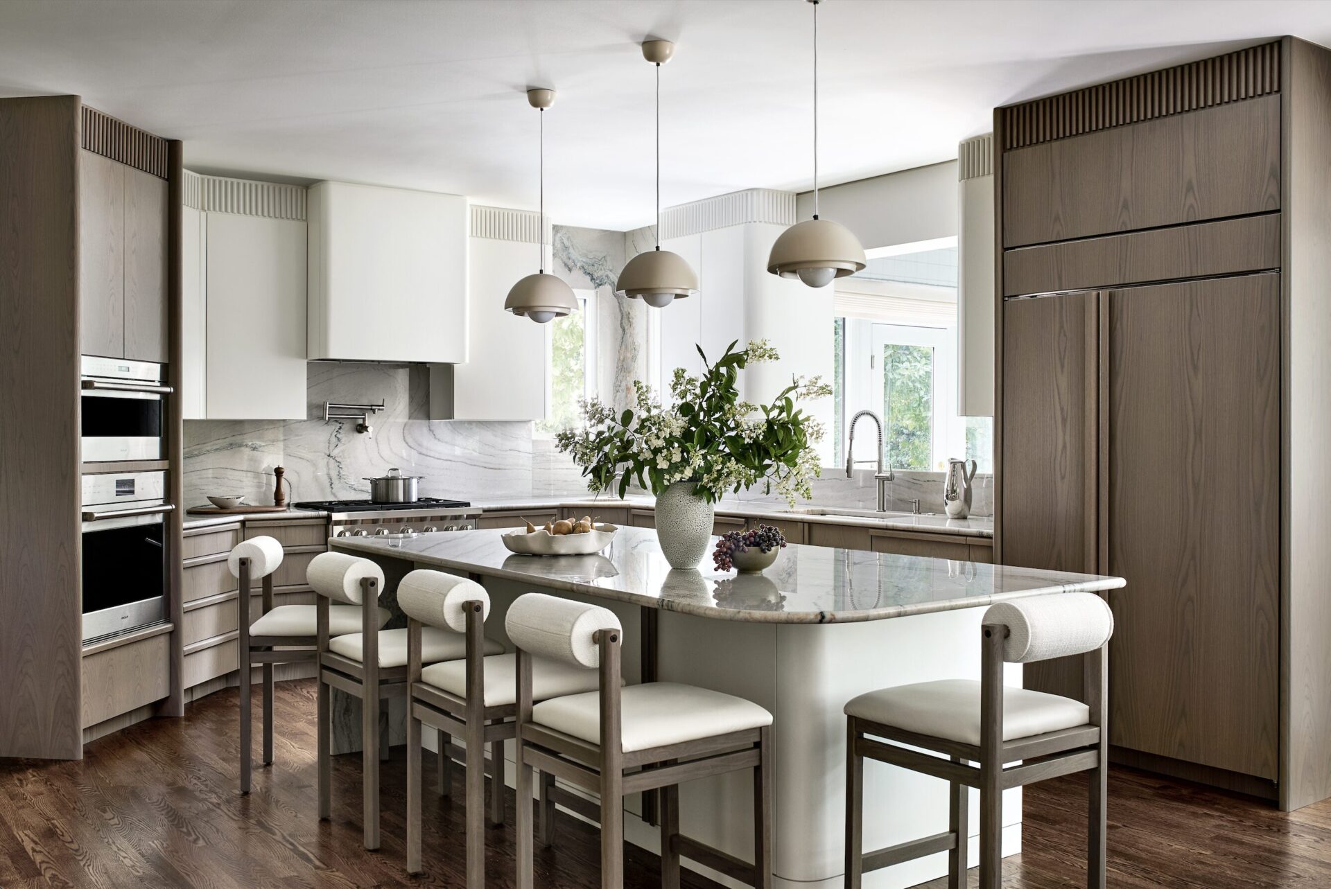
Stylist: Kristi Hunter
Moving Beyond Color Trends in Interior Design
Clients often ask whether a specific shade will feel relevant in five or ten years.
The better question is, Will it still feel like you?
Color trends in interior design evolve constantly. Emotional alignment, on the other hand, remains constant. If a sunny yellow kitchen uplifts your mornings and a moody mauve home office deepens your focus, that resonance will outlast any forecast.
This is why I’ve never subscribed to the idea of “trendy” color. When a hue resonates, or alters the way you feel in a room, it’s doing its job.
Designing with Color for Feeling, Not Fashion
Color is one of the most powerful tools in luxury interior design. Not because it is loud, but because it communicates emotion and authority.
Saturated hues signal confidence. Depth creates focus. Contrast introduces clarity. These are architectural decisions, not decorative ones. When used intentionally, bold color has the power to elevate any space.
Explore our portfolio to see how color, light, architecture, and material come together. Or, connect with the ASD studio to begin designing a space that colorfully rich and distinctly your own.